
I recently installed the preview version of Office 2013. Earlier this summer I had upgraded my Windows 8 build on a test laptop that I have. Office 2013 went on that old box and it installed and works just fine. I mentioned in a previous post that I never could have gotten Windows 7 working on that 4-year old laptop, but 8 was no problem. Same goes for Office 2013.
There are dozens of good reviews to be found on Windows 8 and Office. Personally, I think the flat look of the apps is boring and a step backward. But this post is meant to be a quick look at what Help topics look like – not analysis of the OS and Metro-style.
Opening up PowerPoint 2013, you find the main Help icon in the top right corner of the UI – fairly close to where you find it in 2010. Clicking on that you get the master Help menu shown in Figure 1 in the gallery at the end of this article. On the surface it appears to have the same objective as the Help menu in 2010 – shown Fig. 2. The Getting Started section is similar, but a Tablet topic link has replaced the Ribbon topic. Due to the thumbnails in the 2013 version, you’re only able to see half the topic links visible in the 2010 version. Using image thumbnails dominates the navigation screens in user interfaces now and I guess that ship has sailed. But I’m not convinced the visual benefits of thumbnails offsets the resulting lack of visible choices – especially in Help.
Compare the two online versions with the local version in PP 2010 shown in Fig 3. In that panel you have 34 topic links. I think that topic is poorly designed. Grouping into useful buckets would have made it easier to consume. And 12-15 topics links for a robust product like PP would probably suffice. But the style in Fig 3 shows that you can fit a lot into that amount of screen real estate – a lot more than what you get in the 2013 style.
Figure 4 shows the layout of a PP 2013 topic. The same topic is shown with the 2010 layout in Fig 5. The vertical space allocated to the navigation header has been cut in half. This doesn’t seem like it was a result of going to the new Metro style as much as removing unnecessary and redundant information. It is refreshing to see Microsoft back away from including the Office and Bing logos which have no place in a Help topic. Two navigation buttons/features have been removed. The one that won’t be missed is Keep on Top. I’m not sure whether more than a small percentage of users are even aware of that feature.
The other removed button – the book icon – displays the expanding/collapsing navigation panel shown in Fig 6. This is an unfortunate casualty in the Web’s move to using Search as the sole method of navigation. Without the TOC, the emphasis falls on the single panel Home topic to guide users to a solution. And we saw above how limited that is. It would have been possible for Microsoft to rig a TOC panel to attach to the Help if they wanted to.
As for the topic content itself, the 2013 version is a mirror image of the 2010 version. The Microsoft CMS is using a very similar template for both output targets. Even the typeface is the same. One glaring error not handled by their CMS is to alter the interaction verbs. The topics use “click”, but the new interface is supposed to fully support touch. They should have changed to a generic form, like “select”.
Windows 8/Office 2013 is designed with the assumption that you always have an Internet connection. Just for grins I disconnected my Windows 8 connection and refreshed the Help window. Fig 7 shows the result. The only Help that is available are the topics related to using the ribbon as shown in Fig 8. This is very limited. It seems to me that a text-only version of the full set of Help topics wouldn’t take up considerably more space in the locally installed version of 2013 than the ribbon topics.
-

- Fig. 8 – Sample topic in PP 2013 without Internet connection

-

- Fig. 7 – Default message with no Internet connection in PP 2013

-

- Fig. 6 – Content panel in PP 2013 Help

-

- Fig. 5 – Help topic in PP 2013

-

- Fig. 4 – Help topic in PP 2010

-

- Fig.3 – Help menu in PP 2010 – local version

-
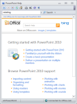
- Fig. 2- Help menu in PP 2010 – Online version

-

- Fig. 1 – Help menu in PP 2013


Pingback: Help Topics in Windows 8 |