
Free webinar Monday, Aug 27, Key Trends in Software User Assistance http://ow.ly/deeHn
More on Windows 8 Help
This is a follow-up to my post on Windows 8 Help topics.
The bottom left of the Help window has a toggle for offline/online versions of the Help. I disconnected from the web and selected offline. The exact same content appeared as for online. I could see that the topics were HTML/CSS but I wasn’t able to find the topic files on the local drive through a text string search. A tip from a colleague got me to the right place.
The locally installed versions of the Help files are located here: Windows/Help/Windows/ContentStore/en-US. There are eight mshc files in there dated 5/19. I was able to open the mshc zips with 7-Zip without a problem. The zips contain all the HTML, CSS, and image files that make up the Help content.
Filed under Help, User Assistance
Help Topics in Windows 8
After writing about the Help in Office 2013, I realized I hadn’t checked out the OS Help for Windows 8.
From the Start screen I tried a Shift+H and it the “Help and Support” tile popped up on the Apps screen. I used the right mouse click to pin the Help app to the Start screen for future reference as shown in Figure 1 below.
Clicking the Help and Support tile opens the app to the Help home page shown in Figure 2. This is a preview release and may not be the final version. But with an October ship date, I doubt the Help is going to change much in the near term. The only navigation is the prominent Search box and the forward/back button in the top left corner. The right corner has icons for Print and Settings.
There are three links right below the Search box (Fig 3) on all Help pages: Help home, Browse Help, and Contact support. Browse Help has the same three top-level items as Help home plus seven other subsections. Interestingly, the Internet and the Security subsections are all the way at the bottom of the Browse page but they are two of the three topics on the Home help. I’m not sure I understand the prioritization scheme of the Help designer. Getting Started is still at the top of the list though.
The language choices for mouse and touch seem to be a mishmash.
- Figure 4 shows one form where “tap and click” is used as the action verb.
- Figure 5 uses touch language – swipe, tap – for the command step. Mouse language is in parentheses below it.
- Figure 6 shows such a mix of styles that it must be an error. Or maybe the Help writer can’t decide which way to go. Step 1 uses the form from Figure 5. Step 2 the form from Figure 4. And Step 3 just uses “click” and omits “tap”. Steps 3 and 4 include UI icons. Icons are used inconsistently in the Help.
The Help topics in general use the plain Metro-style look with default black text and blue headings throughout.Tips and Notes use a grey color. The expanding hidden text effect is still used to layer related content. Some topics include shortcut links directly to the screens described in the topic.
Overall, there have been no innovative moves made in Help for Windows 8. It is basically a repurposing of existing Windows 7 topics with some touch variants.
-

- Fig. 6

-

- Fig. 5

-

- Fig. 4

-

- Fig. 3 – Browse help page

-

- Fig. 2 – Help home

-

- Fig. 1 – Help and Support Tile

Filed under Help, User Assistance
Help Topics in Office 2013
I recently installed the preview version of Office 2013. Earlier this summer I had upgraded my Windows 8 build on a test laptop that I have. Office 2013 went on that old box and it installed and works just fine. I mentioned in a previous post that I never could have gotten Windows 7 working on that 4-year old laptop, but 8 was no problem. Same goes for Office 2013.
There are dozens of good reviews to be found on Windows 8 and Office. Personally, I think the flat look of the apps is boring and a step backward. But this post is meant to be a quick look at what Help topics look like – not analysis of the OS and Metro-style.
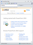
Opening up PowerPoint 2013, you find the main Help icon in the top right corner of the UI – fairly close to where you find it in 2010. Clicking on that you get the master Help menu shown in Figure 1 in the gallery at the end of this article. On the surface it appears to have the same objective as the Help menu in 2010 – shown Fig. 2. The Getting Started section is similar, but a Tablet topic link has replaced the Ribbon topic. Due to the thumbnails in the 2013 version, you’re only able to see half the topic links visible in the 2010 version. Using image thumbnails dominates the navigation screens in user interfaces now and I guess that ship has sailed. But I’m not convinced the visual benefits of thumbnails offsets the resulting lack of visible choices – especially in Help.
Compare the two online versions with the local version in PP 2010 shown in Fig 3. In that panel you have 34 topic links. I think that topic is poorly designed. Grouping into useful buckets would have made it easier to consume. And 12-15 topics links for a robust product like PP would probably suffice. But the style in Fig 3 shows that you can fit a lot into that amount of screen real estate – a lot more than what you get in the 2013 style.
Figure 4 shows the layout of a PP 2013 topic. The same topic is shown with the 2010 layout in Fig 5. The vertical space allocated to the navigation header has been cut in half. This doesn’t seem like it was a result of going to the new Metro style as much as removing unnecessary and redundant information. It is refreshing to see Microsoft back away from including the Office and Bing logos which have no place in a Help topic. Two navigation buttons/features have been removed. The one that won’t be missed is Keep on Top. I’m not sure whether more than a small percentage of users are even aware of that feature.
The other removed button – the book icon – displays the expanding/collapsing navigation panel shown in Fig 6. This is an unfortunate casualty in the Web’s move to using Search as the sole method of navigation. Without the TOC, the emphasis falls on the single panel Home topic to guide users to a solution. And we saw above how limited that is. It would have been possible for Microsoft to rig a TOC panel to attach to the Help if they wanted to.
As for the topic content itself, the 2013 version is a mirror image of the 2010 version. The Microsoft CMS is using a very similar template for both output targets. Even the typeface is the same. One glaring error not handled by their CMS is to alter the interaction verbs. The topics use “click”, but the new interface is supposed to fully support touch. They should have changed to a generic form, like “select”.
Windows 8/Office 2013 is designed with the assumption that you always have an Internet connection. Just for grins I disconnected my Windows 8 connection and refreshed the Help window. Fig 7 shows the result. The only Help that is available are the topics related to using the ribbon as shown in Fig 8. This is very limited. It seems to me that a text-only version of the full set of Help topics wouldn’t take up considerably more space in the locally installed version of 2013 than the ribbon topics.
-

- Fig. 8 – Sample topic in PP 2013 without Internet connection

-

- Fig. 7 – Default message with no Internet connection in PP 2013

-

- Fig. 6 – Content panel in PP 2013 Help

-

- Fig. 5 – Help topic in PP 2013

-

- Fig. 4 – Help topic in PP 2010

-

- Fig.3 – Help menu in PP 2010 – local version

-
- Fig. 2- Help menu in PP 2010 – Online version

-

- Fig. 1 – Help menu in PP 2013

Kayak camping at Safety Harbor http://ow
Kayak camping at Safety Harbor http://ow.ly/i/NmnH http://ow.ly/ctsi3
Filed under Uncategorized
A Relatively Inexpensive Eye-tracking System
Eye-tracking is a technology-based technique that can provide some unique insights into how our users interact with a software user interface. There certainly are a number of pros and cons to using eye-tracking. However, the best software designs often come from having a wide variety of research tools at our disposal.
Small-business practitioners who would like to conduct their own eye-tracking research often find the relatively high cost of the systems to be prohibitive. Prices in excess of twenty thousand dollars only fit the budgets of fairly large organizations. A more affordable solution – EyeGuide Eye Tracker – is now available from a company called Grinbath. Here is a quick look at what you can expect from this product.
EyeGuide comes with hardware and software components. A series of videos on the EyeGuide web site takes you through the process of connecting and calibrating the hardware. The eye rig consists of a headband attached to which is a battery pack, camera and an LED light source. A simple on/off switch is the only control on the headset.

Using a headset is a less than optimal way to gather eye-tracking data. It definitely adds a foreign element into the experiment and may be distracting to the test subject. Setting it up with each subject requires fitting and calibrating the unit while it is on their head. On the positive side, it makes the system very portable and probably contributed to its relatively inexpensive price.
The image from the headset is controlled by EyeGuide Capture software, available for PC and Mac. The Capture application is presented in a window with a live black and white viewer showing what the camera is picking up. The connection between the computer and the headset is through a USB radio transmitter that plugs into the computer.
It took me about 30 minutes of experimentation to figure out the best headset arrangement. The camera and LED should be positioned about two to three inches below the eye. When it is correctly positioned the Capture viewer shows a green circle lock on the pupil.
At first, I had some problems getting a clear signal from the camera. It turned out that the rat’s nest of devices, plugs, cables, and lights on my desk was causing the interference. The camera operates at 2.4 GHz, the same frequency as a lot of wireless devices. Everything cleared up when I ran the system from my laptop in a room with no other electronics.


The next step is to create a series of instructional steps for your experiment using the Capture software. These instructions are displayed to the test subject in sequential order after the test is started. A checkmark icon appears in the bottom corner of the test screen. When the subject completes a step, they click the icon to display the next instruction. The eye-tracking data is being recorded throughout the experiment.
A separate application, Analyze, is used to review your data. A tabbed interface gives you a number of ways to look at it. First, there is a real-time animation of the experiment – Replay – that uses a circle to represent the focus of the eye moving around the test screen. The Gaze Plot provides a more detailed animation drawing straight lines between major dwell points (shown below). The Reply and Gaze plots give you a good overall understanding of what attracted the attention of the test subject in the UI.

Gaze Plot in Analyze Software
Three other plots – Heatmap, Bee Swarm, and Clusters – provide supplemental views of the data. All the map plots are controlled with Play/Pause buttons. It would be nice if the video progress bar could be clicked on to instantly jump back and forth in the video.
You can export any video or image frame of any recording. You can also get the gaze plot data in CSV format which shows you the pupil x and y coordinates at 50 times per second. If you want other data points, such as pupil diameter, you can use the API which also comes with the system.
The camera and camera arm are encased in plastic. It appears that it would be durable over time. My demo unit came with a AAA battery charger and I needed it. I forgot to turn off the unit and the batteries were dead when I got back to it the next day.
There are alternate LED attachments for different users and for replacements. A short LED is optimal for quick set up and calibration for users without glasses or obstructed pupils. The longer LEDs are intended for more flexibility, so that people with glasses or otherwise obstructed pupils can get proper lighting for a good lock and a good calibration.
The only part of the hardware I didn’t like is that the USB receiver has a wide body and took up two USB slots on my laptop. Also, with the quick battery drain I experienced, don’t forget to keep the charger handy.
The price is $2,495 USD for commercial customers, $2,295 USD for academics, government, and nonprofits. There is discounted pricing for multiple unit purchases.
All software upgrades are free, so any addition to future versions will be available to all customers with complete backwards compatibility. They promise customer support with a turnaround of one business day maximum via support forum, email (support.grinbath.com), and Skype.
In summary, this device provides a relatively affordable solution for organizations with limited budgets. The headset introduces an artificial experience into any experiment, but it makes the unit portable. It is pretty rugged and should work well on field trips. The Capture and Analyze software gives you all the data and quality you need for simple experiments. If you are looking to add eye-tracking to your software design and testing, this is a great value.
For more details, contact Jeremy Huston, EyeGuide™ Product Manager, Grinbath LLC, jeremyhuston@grinbath.com, http://www.grinbath.com/eyeguide/
Filed under Uncategorized
Nice article by Jeff Sauro on unnecessar
Nice article by Jeff Sauro on unnecessary messaging in applications: http://ow.ly/ceX6t
Filed under Uncategorized
Notes from Google I/O
Last week was Google’s big week for announcements. I had tried to buy a ticket for the conference a couple months ago. The morning that tickets were scheduled to go on sale I got set up with my laptop about thirty minutes in advance. Internet connection: check. Registration page bookmarked: check. Google Wallet set up: check. Accurate time clock: check. At exactly 7am I refreshed the registration page and clicked the button to register. Waiting, waiting, waiting, “No tickets available”. Various news blogs wrote that tickets sold out in twenty minutes but it was more like forty-five seconds as far as I could tell.
Anyway, the sessions are all available on YouTube. The keynotes get all the publicity but there are dozens of technical sessions. I had a chance to check some of them out this weekend. There were two which had interesting nuggets of info.
The Web Can Do That? with Eric Bidelman
http://www.youtube.com/watch?v=X_ek1wSe66o
This session was Eric talking about some of his favorite technologies. Most of it was related to HTML5/CSS3. One of the things he highlighted was “flex box”. This is a model for creating compartments for content so that they automatically and gracefully adjust size and position. It can be used with media queries to reorganize content for different display sizes.
I hadn’t been aware of flex box even though it has been around for a couple of years. The W3C has a working draft in last call: http://www.w3.org/TR/css3-flexbox/
Eric also reference an interesting site, HTML Rocks: http://www.html5rocks.com/en/
What’s New in Android?
http://www.youtube.com/watch?v=Yc8YrVc47TI
This session provided a deep dive into many of the technical details of Android 4.1 Jelly Bean. One of the sections (28 min. in) dealt with two new elements of Notifications – both of which may be of interest to UA designers. One is a new feature called bigContentView. This is an expansion of ContentView which can present an icon, a title and a short amount of text. The new view is bigger. It is taller and support photos, buttons, and more room for text. I could see where a bigContentView would be a great canvas for first-time user instructions.
The other new Notification feature is called Priority. It lets you tag notifications on a range from very important to very optional. The Android UI is then automatically configured to display notification appropriately, depending on what is going on in the app. A very important message could be tagged as MAX whereas a helpful tip might be tagged MIN. In between are three other mid-range settings – HIGH, DEFAULT, and LOW.
Google TV?
I think it is interesting that there was no mention of Google TV in the keynotes or the technical sessions. Whether or not that is significant is for the pundits to decide. Personally, I’m not as interested in Google TV specifically as I am about the design of apps for big screens in general.
I had searched for sessions on Google TV, figuring there would be some. I did find two – but they were both from the 2011 event. However, I hadn’t seen them before and they each had some interesting information that is still relevant and generally applicable to large-screen app design.
Building Android Apps for Google TV with Christian Kurzke
http://www.youtube.com/watch?v=CxLL-sR6XfM&feature=player_embedded
In this session there were a few good tips:
- Make sure the UI or your app recognizes that a remote with a D-pad is likely to be the primary controller. With a D-pad you need to carefully arrange your UI elements to minimize the number of button presses. Anyone who has tried to type something with their cable TV controller knows what a pain this can be.
- The display size of a large-screen TV is not really larger than a desktop PC screen when you factor in the distance we typically sit relative to the TV. They did calculations based on screen size combined with pixel densities and viewing distances and came up with some useful guidelines. Some of the details are here: https://developers.google.com/tv/android/docs/gtv_displayguide
- The over-scanning that TV manufactures put into their displays can result in unpredictable effects. They suggest letting the Google API do the heavy-lifting to appropriately scaling content. Make sure you’re using relative positioning for UI elements so that they can automatically scale and position themselves.
Building Web Apps with Google TV with Chris Wilson
http://www.youtube.com/watch?v=n8hjjSzgRyw&feature=player_embedded
A similar session from 2011 was hosted by Chris Wilson, the long-time Internet Explorer product manager who now works at Google. Some of the issues were redundant with the Kurzske talk but Chris also discussed color contrast and scrolling cues.
One other interesting suggestion he made was to add activity to the UI of a TV app. Since TV is a passive medium, most TV programs have a lot going on all the time. You want to keep your app UI active so the viewer doesn’t think something is wrong.
In the second part of the session, Daniels Lee presented the Google TC jQuery UI library which he said was particularly useful for doing TV app prototyping.
Filed under Uncategorized
Mobile User Assistance Online Course
I be will teaching an online-only course through the U.C. Silicon Valley Extension. It starts the week of July 11 and goes through the week of August 17. All the coursework is done online.http://course.ucsc-extension.edu/modules/shop/index.html?action=section&OfferingID=5270231&SectionID=5271487
Description
Smartphones have spurred the rapid emergence of a huge new software segment: the mobile application. This new field and its virtually limitless implementations present important questions for user assistance professionals: What is the future role of UA in mobile app development and support, and how can one prepare for success in that role? As the mobile app market continues to soar, this is becoming the next frontier for user assistance professionals. Upon completing this course, you will understand the mobile platform and its unique technical and design considerations. You be ready to plan mobile UA, design and write UA for mobile apps, and understand the tools necessary to develop and deliver UA for mobile apps.
Filed under Uncategorized
Document Design Class at Bellevue College
I’ll be teaching Fundamentals of Document Design at Bellevue College next month. The five-session class starts July 25.
http://www.campusce.net/bc/course/course.aspx?C=1123&pc=854&mc=855&sc=859
Designed for both aspiring and experienced technical writers and editors, this course provides an introduction to the basic elements of document design, including layout, color, and typography for print documentation. Students gain experience and performance feedback while working individually to develop a user manual.
Filed under Uncategorized


